Accessibility
Philosophy and Approach
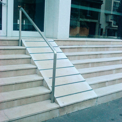
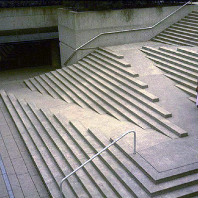
Dojo 2 is grounded in the belief that accessibility is as important online as it is in our physical environments, and architects of both share a similar responsibility to provide access to all. Accessibility failures abound in each setting, and they can be very obvious once one starts looking:
 |
 |
|---|---|
| Afterthought Accessibility | Designed Accessibility |
Web developers have an additional hurdle to jump over, since accessibility failures online are often invisible and silent. Without proper testing, it is all too easy to add a redundant title attribute to a link or create a <label> while forgetting the for attribute.
The increasingly fleshed-out specification and support for ARIA attributes is fantastic, but can feed into the false impression that accessibility is achieved by slapping an aria-labelledby or role onto a finished widget and calling it done. The only approach that has the potential to deliver truly equal access is to begin thinking about accessibility in design and continue through to development and testing. For that reason, Dojo 2 has no separate accessibility mixin; all Dojo 2 widgets have been designed to be accessible by default, and any tools needed to meet WCAG standards have been integrated into @dojo/widget-core and @dojo/widgets.
Using Dojo 2 widgets
All widgets provided through @dojo/widgets have been created with a range of assistive technologies and perceptual differences in mind. Wherever possible, Dojo 2 takes advantage of built-in accessibility by using native elements; if it looks like a button and acts like a button, it should be a <button>. Widgets that go beyond the functionality provided by native elements use internal logic to provide proper semantics and non-mouse interaction.
As with all code however, Dojo widgets are not foolproof. There are a number of instances where additional information is required of the widget author before peak accessibility can be achieved. A framework can only go so far before it becomes the developer’s responsibility to provide label text or correctly set attributes such as type or role. Each widget’s example page models best practices, and scanning through available widget properties is a good way to check for any missing accessibility enhancements.
Below is a list of widgets in @dojo/widgets, along with a description of the keyboard interaction (if applicable) and any properties included primarily for accessibility (shortened to a11y):
Label
All form widgets apart from the Button contain a label property that allows widget authors to easily associate a text label with the control. Label is also available as a separate widget for use with custom form controls. The Label widget included with Dojo form widgets is associated with the form input by wrapping the input as a child element. When used separately, it is also possible to explicitly set the forId property to the id of an input.
Separate Label + Input example
w(Label, {
    forId: 'foo',
    label: 'Foo Label Text'
}),
w(TextInput, {
    id: 'foo',
    type: 'text'
})
The label property on both form field widgets and the Label widget accepts either a string or an options object that allows customization of where the label is placed (before or after the input) and whether it is visually hidden. The latter makes use of screen reader-accessible CSS styles to hide text content and is recommended for use with form controls that have no visible label.
A <label> element with hidden text was chosen over the aria-label attribute for invisible labels due to still-inconsistent screen reader support for the latter. Should this change, we will update our hidden label implementation to aria-label without changing the public-facing properties.
TextInput and Textarea
As with all basic form controls included in @dojo/widgets, TextInput and Textarea use native <input>/<textarea> elements, which allows them to take advantage of built-in accessibility.
A11y properties
controls: Text inputs can sometimes be used to control an interactive dropdown. In this case,controlscan be used to setaria-controlsto theidof the controlled element.describedBy: Sets thearia-describedbyproperty to point to theidof an element containing additional descriptive text. Screen readers usually read the descriptive text after the label text, followed by a short pause.label: Controls the wrapping<label>element.type: Specifying text input type toemail,search, etc. when applicable provides more information to screen reader users in addition to other benefits like showing the most helpful mobile keyboard.
Button
The Button widget returns a simple <button> element with native support for use with keyboards and assistive technology.
A11y properties
describedBy: Sets thearia-describedbyproperty to point to theidof an element containing additional descriptive text. Screen readers usually read the descriptive text after the label text, followed by a short pause.popup: This can either be set totrueto simply set thearia-haspopupproperty, or it can be passed an object withexpanded: true/falseandid: stringproperties to controlaria-expandedandaria-controls. This is recommended for any button that opens a dialog, dropdown, or menu.pressed: For use with buttons that toggle on/off. Sets thearia-pressedproperty.
Checkbox
The Checkbox widget wraps a native <input type="checkbox">, which provides native accessibility and keyboard interaction.
Checkbox can also be used as a toggle switch with optional onLabel and offLabel properties. When a string is passed to onLabel, it will be read at the end of the label text when the checkbox is checked. A string passed to offLabel will be read when the checkbox is not checked.
A group of related checkboxes should ideally be wrapped in a <fieldset> element containing a <legend> with descriptive text.
A11y properties
describedBy: Sets thearia-describedbyproperty to point to theidof an element containing additional descriptive text. Screen readers usually read the descriptive text after the label text, followed by a short pause.label: Controls the wrapping<label>element.
Radio
Radio creates a single wrapped <input type="radio"> input, providing built-in accessibility and keyboard interaction. It is best practice to wrap a group of radio buttons in a <fieldset> element that contains a <legend> with descriptive text.
A11y properties
describedBy: Sets thearia-describedbyproperty to point to theidof an element containing additional descriptive text. Screen readers usually read the descriptive text after the label text, followed by a short pause.label: Controls the wrapping<label>element.
Slider
A native range slider offers limited visual customization, so the Dojo Slider widget creates an invisible native <input type="range"> input that controls a custom track, thumb, and fill. This allows the widget to take advantage of native accessibility and keyboard interaction without sacrificing styling.
The current value is wrapped in an <output> element that points to the id of the native input.
A11y properties
describedBy: Sets thearia-describedbyproperty to point to theidof an element containing additional descriptive text. Screen readers usually read the descriptive text after the label text, followed by a short pause.label: Controls the wrapping<label>element.
Select
Select is currently the only Dojo form widget that makes use of a fully custom solution. Since it is impossible to customize <option> elements, the component instead re-creates select functionality from scratch. The end result is a popup button that controls a dropdown menu (with role="listbox") of options.
ARIA attributes are used to associate the button with the menu and focused option. They are also used to provide semantics for read-only and disabled options, as well as setting the entire select field to be read-only, invalid, or required.
It is also possible to use Select to create a widget using the native <select> element by passing useNativeElement: true to the properties object.
Keyboard interaction
- Down arrow: Focuses the next option, wrapping from last to first, or opens the menu if closed
- Up arrow: Focuses the previous option, wrapping from first to last
- Home: Focuses the first option
- End: Focuses the last option
- Enter & Space: Selects the focused option and closes the menu, unless the option is disabled
- Escape: Closes the menu without selecting an option
Disabled options are focusable but not selectable within the menu, per WAI-ARIA recommendations.
A11y properties
describedBy: Sets thearia-describedbyproperty to point to theidof an element containing additional descriptive text. Screen readers usually read the descriptive text after the label text, followed by a short pause.label: Controls the wrapping<label>element.useNativeElement: Switches to using the native<select>element, with some trade-offs to customizability.
ComboBox
ComboBox is similar to Select, but provides a text input that filters available options in addition to a button that opens the option menu. The markup is similar in that the menu comprises of a listbox of options with role="option" controlled by both a text input and button.
Since both the button that opens the options menu and the button that clears the textbox value rely on icons, hidden screen reader-accessible text is also provided. Focus is programmatically returned to the text input when the clear text button is pressed or when the dropdown is opened.
Keyboard interaction
- Down arrow: Focuses the next option, wrapping from last to first, or opens the menu if closed
- Up arrow: Focuses the previous option, wrapping from first to last
- Enter: Selects the focused option and closes the menu, unless the option is disabled
- Escape: Closes the menu without selecting an option
A11y properties
inputProperties: Can be used to set any properties, includingdescribedBy, directly on the innerTextInputwidgetlabel: Controls the wrapping<label>element.
TimePicker
TimePicker wraps the ComboBox widget, so all keyboard interactions and accessibility properties are the same across both widgets. The only difference is TimePicker also provides a native <input type="time"> option controlled through useNativeElement.
Calendar
The Calendar widget renders a date grid with dropdown month and year pickers. Both the month and year dropdowns use a popup button, and control focus between the button and popup when opened and closed. Focusable items in hidden popups are removed from the focus order.
The date grid itself uses a <table> element with weekdays as the column headers. Hidden accessible text is provided for the previous/next pagination arrows that only visibly display an icon. The date table is labelled by a hidden <label> element showing the current month and year. It has aria-live="polite" so screen readers will be notified when the displayed month changes, e.g. when a user navigates to the next month via arrow keys.
Keyboard interaction
Items in the focus order for this widget in its initial state are the buttons for the month and year pickers, the currently focused date, and the previous and next month buttons. The following keyboard interactions are available when focus is within the date grid:
- Left arrow: Moves focused date to the previous date
- Right arrow: Moves focused date to the next date
- Down arrow: Moves focused date to the same day of the next week
- Up arrow: Moves focused date to the same day of the previous week
- Enter & Space: Selects the focused date
- Page Up: Moves focused date to the first day of the month
- Page Down: Moves focused date to the last day of the month
When the focused date moves to a day in the next or previous month, the date grid will refresh.
A11y properties
labels: The Calendar widget has a number of internal descriptive labels, and this property allows their text to be customized
Dialog
The Dialog widget creates a controlled dialog element. Controlled focus is not yet implemented, but will be added along with the focus manager in a future Dojo release.
A11y properties
closeText: Provides hidden, accessible text for the icon close button. Defaults to “close dialog.”role: The default role for the dialog container isdialog, but it can be changed toalertdialogthrough this property.
SlidePane
SlidePane is similar to dialog in that it creates a modal that overlays page content. It will need similar programmatic focus control, pending completion of the focus manager.
A11y properties
closeText: Provides hidden, accessible text for the icon close button. Defaults to “close pane.”
TabController
TabController creates a set of tab buttons that control the content of a container. The tab buttons use role="tab" and are associated with their content through aria-controls and aria-labelledby. Only one tab button is in the tab order at a time, and arrow keys are used to switch between tab buttons. This approach both directly follows the ARIA Authoring Practice Guidelines and avoids polluting the tab order with a large number of tab stops in the case of a single TabController with many tabs.
Keyboard interaction
- Left arrow: Moves to previous tab button, wrapping from first to last
- Right arrow: Moves to next tab button, wrapping from last to first
- Down arrow: Moves to next tab button only on vertically oriented tabs
- Up arrow: Moves to previous tab button only on vertically oriented tabs
- Page Up: Moves to first tab button
- Page Down: Moves to last tab button
- Escape: Closes focused tab button if it is closeable
TitlePane
TitlePane creates an accordion widget, which is functionally a button that expands a content container. Collapsed content is obscured with aria-hidden, and the button and content container are associated with aria-controls and aria-labelledby.
A11y properties
headingLevel: Optionally customize the heading level of the button controlling the accordion.
This overview only touched on properties that primarily exist for accessibility-related reasons, but any design decision or property change will end up affecting accessibility in some way. For some of those, such as invalid, disabled, and readOnly, widgets included in @dojo/widgets handle setting ARIA attributes in the background in addition to toggling classes without any extra attention needed from the author. In other cases, such as getResultLabel in ComboBox or renderMonthLabel in Calendar, it is entirely up to the author to ensure the returned result includes clear, screen reader-accessible text content.
Styling
The base Dojo 2 theme meets WCAG AA color contrast guidelines, but it is up to the widget author to double check the final styles as changes to font size or background could affect readability. Widget CSS packaged with Dojo 2 also includes :focus styles for all focusable nodes.
There is a set of base styles provided by @dojo/widgets separate from themes, containing basic utility classes like .visuallyHidden, which will make content invisible to sighted users but still allow it to be read by screen readers. To use it, import baseCss separately like so:
import * as css from ‘path/to/your/css’;
import * as baseCss from ‘@dojo/widgets/common/styles/base.m.css’;

@theme(css)
class MyWidget extends WidgetBase {
    render() {
        return v(‘div’, {
            classes: this.classes().fixed(baseCss.visuallyHidden)
        }, [ ‘Screen reader instructions’ ]);
    }
}
A more in-depth introduction to classes and theming is available in the Theming tutorial.
Focus management
Dojo 2 will provide a focus manager for situations where focus needs to be directly managed, since the virtual DOM approach means directly touching the DOM within widgets is discouraged. This feature is currently in development.
Writing custom widgets
All DOM attributes can be set with VirtualDomProperties so, apart from managing focus, no extra tools should be required to create strongly accessible widgets. The widgets tutorial goes over widget creation in more technical detail, but the following example shows how to create proper ARIA attributes for an accessible popup button:
v('button', {
    key: 'buttonKey',
    'aria-controls': 'popupId',
    'aria-expanded': String(this.properties.expanded),
    'aria-haspopup': 'true',
    id: 'buttonId',
    onclick: this._togglePopup
}, [ 'Click to open popup' ])
Since this example uses a <button> element, it requires neither an explicit tabindex nor an onkeydown event to work properly with a keyboard. However, while native functionality is the easiest and most straightforward path to good accessibility, there are times when it’s just not possible or no such element exists.
For those times when native functionality is insufficient, this handy checklist is a good starting point for planning a soon-to-be accessible widget:
- Ensure nodes that support any sort of user interaction are both focusable and have accessible descriptive text.
- Leave native focus styles intact, or provide a sufficiently visible alternative.
- Check the WAI-ARIA Authoring Practices 1.1 for information on node attributes and keyboard interaction for many common widget patterns. Even for more complex widgets, these serve as good building blocks.
- Make a quick proof of concept and try inspecting its accessibility attributes in the browser and running through one of the many excellent a11y checklists.
- Try operating the widget with only a keyboard and, if possible, a screen reader.
- If applicable, try turning off your sound.
- Look at your widget with high contrast mode enabled.
Designing web applications to be accessible is often perceived to be a difficult problem. While some work is required to ensure that all users are served as well as possible, Dojo 2 has simplified the work as much as possible. By providing the correct properties and considering things like color-contrast, a web application can reach entire new groups of users.